The Importance of Hiring a Professional Book Cover Designer
 Getting the right book cover is in the 3 most important things you will do to attract sales to your novel. The cover is the window to your story. If your window is dirty, nobody will want to see inside. The cover is the first thing readers see. This is the determining factor regarding whether they pick your book up to read the back blurb (or scroll down to read the blurb if it’s in an ebook format.) Your cover must be good. More importantly, to be taken seriously, it should be professional. If that cover doesn’t grab a reader’s attention—you’ve had it, and they’ve already moved onto the next book on the shelf. When buying their cover, first-time novelists will tend to look at two things.
- Price
- Whether they like the designer’s art
However, there is far more to consider. If you don’t get it right, you’ll run into a viper’s nest of problems when you come to upload your book for publication. People want cheap. And where there’s a demand, there is always a supply. You want a book cover for $10.00? No problem. Contact us for advice, and we’ll suggest you look on the Facebook groups. There are thousands out there, some might even be okay, but it’s a massive gamble on your part.
Professional Vs Bedroom Designers
Many of the thousands of people advertising themselves as cover designers will knock something up for 50.00 dollars or under. Think about that. In actual work-time salary, what does it equate to—an hour of a professional’s time? Creating a full-wrap cover, takes hours of work. The 50.00 dollar cover designers are probably people doing it as a hobby or working on the side. Okay, so you might get lucky and find somebody who has a day job as a designer and has done book covers as part of his work. In that case, go for it. Bargain. However, the tradesman knows his worth. He is still likely to charge more, even for working of an evening and at the weekend.
eBook Only Against eBook and Paperback
You may choose to publish only in eBook format.
Why?
Why would you do that when you can publish both formats for free with Amazon KDP and many other publishing platforms?
Indie authors go down the route of only publishing ebooks because they are doing the work themselves, and formatting for both book covers and typesetting is tricky. The eBook format is the easier option. Publishing for indie authors can be free. Take the money you’ve saved on getting your book out there, and put it into editing, book cover, and formatting that is provided professionally.
There is nothing like the feeling of holding your book in your hands for the first time—it never gets old, and the only similarity is holding your child for the first time.
The advice given in this article is sound. The labourer is worthy of his hire, and hiring a professional to make your book excellent makes all the difference. A professional designer will do a better job in a faster timeframe for excellent results. Best Book Editors will create an awesome book cover that you will be proud of. Contact us through our quote page for details.
This article is concerned with book cover design, but there will be a sister article on the intricacies of typesetting and the pitfalls to watch out for.
eBook Cover Design Only.
If you decide not to publish your book in print, you stand a far better chance of getting a half-decent cover on the cheap. Giving a fair and balanced appraisal, there are some people advertising that can do a good ebook cover. And while you may still have a heavy chance of not uploading it due to image size and quality, the odds of getting it right are better.
Why is it easier to create an eBook Cover?
Because it’s masquerading in disguise. It has no spine, no back, no blurb, barcode or logo. It is a single-page design. There are still many things to get right. You need to watch your leading and kerning, blending and shading, bleed and trim size, font-weight, spacing and symmetry. It may still fail an upload, and you may have problems—but, if you’re lucky, maybe not.
Why Hire a Professional?
Why pay more to hire a professional over somebody that suggests that they can do your cover on the cheap? Because, my friend—you get what you pay for.
Most cowboy designers will not be using paid-for design software and rely on free—limited—programs. Yes, they work. However, a professional designer will have up-to-date software such as InDesign or Photoshop with all the latest features, fonts and advances.
- A professional designer has learned his craft through years of experience
- He’s time-served
- He probably runs his own business with premises and overheads
- He has spent years building a reputation.
He will produce a cover for you that will upload to your chosen platform first time every time.
At Best Book Editors, we have one clear, low price for book cover design. We have secured a top designer with 20 years’ experience, and the reason that we can offer our clients this price is that we’ve struck a fantastic, long-term deal with him. We will create both your ebook and paperback cover for your chosen platform. We will include your ISBN and create your barcode—a single price to have your book cover in both formats. Best Book Editor’s book cover design price is …
 £150.00 / $215.00
Please visit our quote page and order yours now.
The Science Bit!

We’ve established that producing a book cover isn’t just a case of finding a free stock image—or stealing one with a charge owed to the artist—it happens all the time! Most people, cowboy designers included, have no idea what is involved in getting it right—I certainly didn’t. It’s been a learning curve finding out what to ask. So, we’ll look at some pointers that separate the wheat from the chaff to help you spot the real deal from the cardboard house.
Perhaps the most significant fault we see in thrown-together covers is a lack of or unprofessional blending and merging. Some covers are so poor that they are literally a clipart graphic and a Word Doc font. Then, we move up a grade to the standard of many covers out there. The ‘designer’ has gone to the trouble of searching for a site offering free images. They use a single image and a fancier standard font, and Bob’s-your-uncle, you have a cover. It’s a massive improvement—but it’s clear to everybody that it isn’t a professional design.
We jump again to the better amateur covers. The amateur’s getting clever. He’s using layered images to make his designs, and some good cover designs are created this way. However, certain images should be indiscernible from the next. They should blend and swirl into each other with no visible join or harsh edges. You can’t just copy and paste an image, plonk it in the middle of your page and expect it to sit well. Unblended covers stand out like large ladies with a visible pantie line.
The front and back cover don’t have to have the same image. They can be different. However, most professional covers have an extended wrap with the images blended into one another when they are different graphics. For an extended graphic, it should be a continuation of the same image, with the correct blending and gradients.
Fonts should be embedded in the final print-ready PDF or converted to outlines if the font can’t be embedded. Don’t forget not all fonts are free for commercial use. Make sure you check the licencing before using your chosen font.
Another common mistake is that people will blend spine to front. It is easier to avoid harsh lines by blending front-to-spine-to-back. The most popular publishing platforms are prone to trim/cutting and bleed errors. It is a couple of millimetres, but if you don’t blend correctly, the spine will leak onto your front cover and will be visible. Sometimes, the join between the front cover and the spine isn’t on the fold. It can slip in either direction, even onto the front. Blending the front, spine, and back makes it less of an issue. This is most noticeable if you have different images on each section of your full wrap.
Trim and bleed errors are an issue on every edge of your cover. You must ensure that you leave sufficient room for the cut. Both KDP and IngramSpark recommend 3mm on all sides.
The height, width and length of your fonts should be considered with care, and text elements should line up front-to-back. If you put a ruler against the first piece of text on the front, it should be a straight line to the beginning of the blurb on the back.
Font families come in various weights (thin, narrow, semi-bold, bold, heavy etc.). A professional cover designer knows the best font styles for your genre.
Leading and kerning is the visual space between the letters. You can set your kerning to optical or metrics depending on your requirements. Every text element of your cover should be correctly spaced with consideration given to leading and kerning. If you are using symmetry, close enough won’t do; it must be perfect. Even asymmetric covers need to be aligned with precision. The back blurb should fill the area on the back cover well. It shouldn’t be either too condensed or too distributed.
Another standard error is that inexperienced designers put the book title and author name on the back cover. If you look at most mainstream books, there is no title on the back. This is personal preference, but if you want your cover to be professional—you have to follow professional design principles.
The same font should be used for the book name on the front and spine. It should be consistent on the half-title and title page, too. This principle applies to the author name, as well. Capitalisation should be the same, and the weight and size ratio should be complementary.
Your cover design should have space to breathe. Negative space is equally as important as positive.
If you have an author photo, publisher logo, and barcode, they should be positioned with care. They are more professional when aligned and at the same height.
When your barcode is generated, it will sometimes be a square box. A professional designer knows how to create the illusion of it being rectangular. The barcode sits far better with a rectangular shape. It’s a more professional look. Don’t forget there is a massive difference between ISBN and ISSN. Make sure they know the difference.
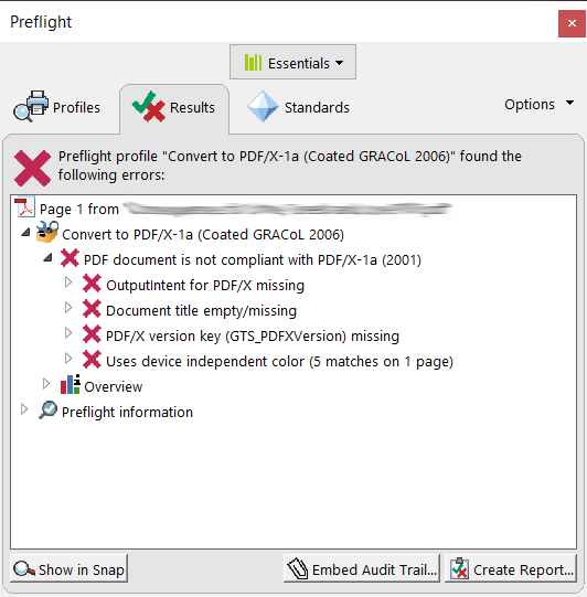
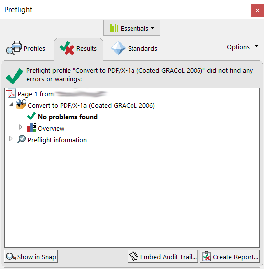
Before your book can be uploaded, it must be formatted to X-1a standard. It must pass a print-production preflight check. It has to be converted from RGB to CMYK. All fonts need to be embedded or converted to outlines, and compression (bicubic downsampling) must be at a minimum of 300 PPI. Printer marks should be disabled and the document bleed active.
Below is an example of a failed print-production preflight check. Best Book Editors put out an advert for a cover designer and had numerous responses. We replied to a dozen of the most prolific advertisers on FB groups and Fiverr and asked for samples. We requested print-ready examples of their work and put 12 covers through a print production preflight check. We were amazed when not one of them passed without issues.
Example of a failed preflight check.
Example of a successful preflight check.
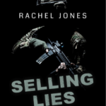
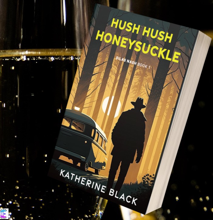
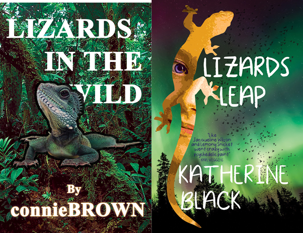
And to finish, just for a bit of fun, I knocked up my interpretation of what a dreadful design might look like against a professionally designed front cover. See how many design faults you can find.
Would you let somebody without the relevant qualifications and skills build your kitchen or plumb in your bathroom?
The moral of the story—hire a professional.